Design Studio
| Table of Contents | |||||
|---|---|---|---|---|---|
| Ideation Studio | Main Page | Design Studio | Project Hub | Build Studio | Go Live |
Design Studio
The Design Studio helps users choose the right solution by providing a variety of pre-defined modules for their projects. These modules can be customized to suit individual needs, allowing users to personalize their pages. Additionally, users can easily view and calculate estimated costs through the platform.
Solution List
The first step in creating a project.
The solutions list is composed of pre-defined solutions with modules that can be build. The list also includes the DESCRIPTION for each solution and the ESTIMATED PRICE PER SOLUTION.

| Feature | Description |
|---|---|
| Chat with Xamun AI for Suggestion | • If clicked, it will redirect to Xamun AI Advisory • Allows users to engage in a chat session with Xamun AI for obtaining suggestions. |
| Search and Select Solution | • On this page, you may select the desired solution that you want to build. |
| Co - Design with Us | • Schedule a meeting with our team if you want to collaborate with us directly. |
| Category Show All | • Displays all available categories for solutions. • Allows users to categorize their needed solution for easier navigation and selection. |
| Search | • To directly filter your desired solution. |
| View Details | • To show DESIGN PREVIEW. • To begin building your desired solution, please click here. This will provide a brief overview of the application. |
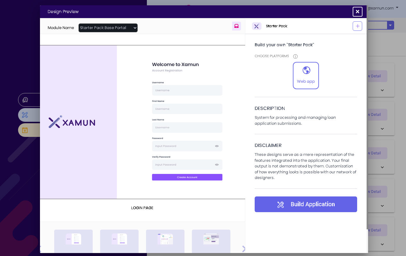
Solution Design Preview
This page contains more specific information that will help you build your application. It has a Page Preview, an Estimated Price per Solution, and Choose Platforms for the solution and descriptions.
| Feature | Description |
|---|---|
| Module Name (Dropdown) | • Selection/List of Pre-Defined/Build Modules. • If clicked, it will list down the different modules included in the application based on the selected solution. • User has the option to select the preferred module and display its information. |
| Arrow Navigator (left and right) | • It will be shown if the selected module has multiple pages. • If left arrow is clicked, it will navigate to the next page. • If right arrow is clicked, it will navigate to the previous page. |
| Choose Platforms | • User has the option to select the preferred platform. • Multiple platforms can be selected. • List of modules dropdown value will depend on the platform chosen. |
| Build Application | • If clicked and validations are met, it will proceed to the LOGIN IN page if the user is not yet logged in. • If clicked and validations are met, it will proceed to CUSTOMIZE MODULE step page if the user is already logged in. • If clicked and validations failed, error message must be shown. |
| Web/Mobile Toggle | • If web toggle is shown, it will show the web view. • If mobile toggle is shown, it will show the mobile view. |
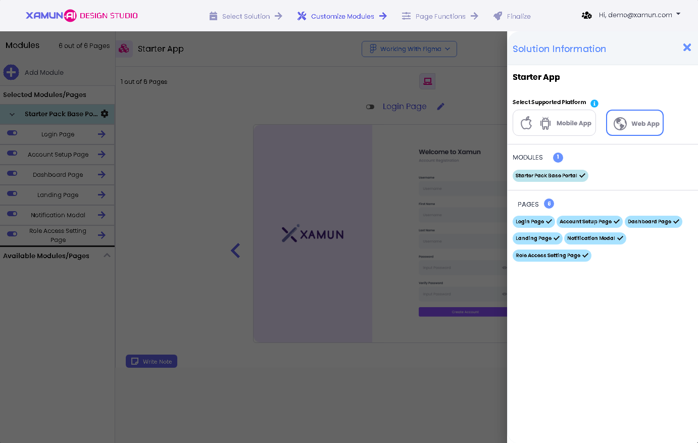
Customize Module
This is the second step in creating a project. It contains the List of Modules, Page Preview, Amount, Module Description, and Solution Information.
In this step, the user can modify or add modules based on the selected Solution to fit the business needs or requirements.
By starting to enter Project Name, Select its Platform, and Short Description for your Project.

| Feature | Description |
|---|---|
| Solution Project Name | • Input here the name of your project. • Required Field |
| Short Description | • Input here a short description of your project. |
| Choose Platforms | • Choose the best platform/s appropriate for your project. |
| Proceed | • If clicked, you can now customized your application's module/s. |

| Feature | Description |
|---|---|
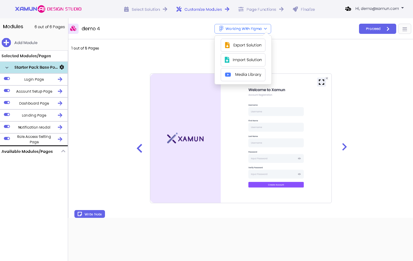
| Working with Figma | • If clicked, you can choose EXPORT SOLUTION, IMPORT SOLUTION, and MEDIA LIBRARY. |
| Number of Module Pages | • Number of pages available from Xamun Library vs to be designed pages suggested by AI. |
| Add (+) button | • Found on the upper left corner of the Module list. • If clicked, it will show a popup to choose beTween ADD NEW MODULE FROM LIBRARY or ADD BLANK MODULE page. |
| Arrow Up/Down Icon beside the module | • If arrow up is clicked, it will list down all the pages of the selected module. • If arrow down is clicked, it will hide all the pages of the selected module. |
| Module Setting (Gear Icon) | • If clicked, it will show the two kinds of adding the page, namely: Add page from library, Add blank page. |
| Clickable Page Name | • If clicked, it will display the page preview. |
| Switch / Toggle Button | • Found on the left side of the page name. • If clicked, it will Toggle button to remove or add page. |
| Right Arrow beside the page name | • If clicked, it will show DESIGN PREVIEW page. |
| Available Modules/Pages | • If clicked, it will display more modules and pages. |
| Proceed | • If clicked and validations passed, it will redirect to the next step. • If validations fail, an error message must be displayed. |
| Menu Icon | • Found on the most upper right corner of the page beside PROCEED button. • If clicked, it will show the SOLUTION INFORMATION page. |
| Web/Mobile Toggle | • If web toggle is clicked, it will show the web view. • If mobile toggle is clicked, it will show the mobile view. |
| Arrow Navigator (left and right) | • It will be shown if the selected module has multiple pages. • If left arrow is clicked, it will navigate to the next page. • If right arrow is clicked, it will navigate to the previous page. |
| Write Note | • If clicked, it will open the Note popup page. |
| Edit Note | • If clicked, it will open the Note popup page with the previously saved information. |
| Add Page from library | • If clicked, it will redirect to ADD PAGE. • See PERSONALIZE MODULE section > ADD PAGE VIEW for more details. • Inside Gear Icon (Module Settings). |
| Add blank page | • If clicked, the screen will show a blank page. • Inside Gear Icon (Module Settings). |
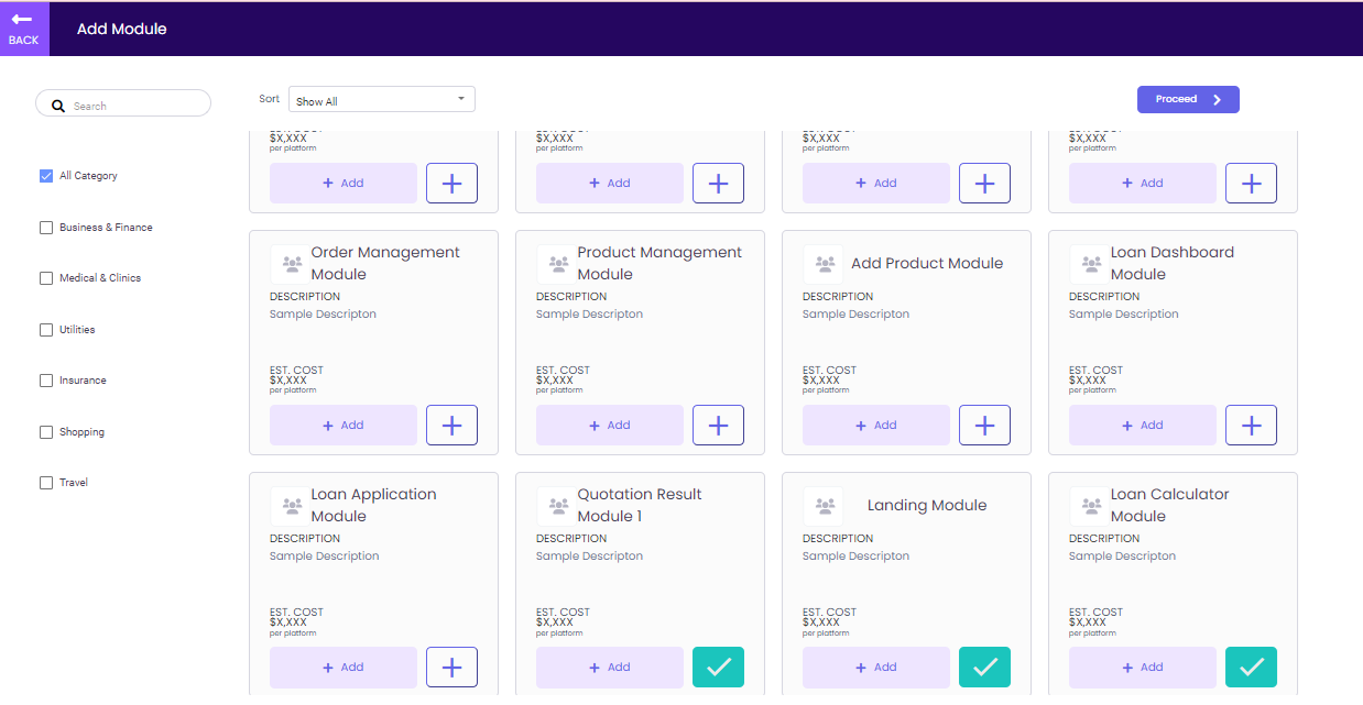
Add Module
This page contains the list of modules not included in the pre-selected modules. User has the option to add more modules through this page.
| Feature | Description |
|---|---|
| Back | • If clicked, it will go back to Customize Module page. • No changes must be saved. |
| Search | • If letter/words are entered will display the filtered modules based on the inputted values. |
| Categories Checkbox | • User has the option to filter the categories. • If category was selected, will display only the modules based on the selected category. |
| Proceed | • If clicked and selected a module will go back to Customize Module page and include the selected module in the Module List. • If clicked and nothing is selected will go back to Customize Module page. |
| Add | • If clicked will be selected and listed on the last part of the modules. • Check mark will be shown instead of add button. |
Add Page view
This page contains the list of pages not included in the pre-selected modules. The user has the option to add more pages through this screen and be part of the solution building.

| Feature | Description |
|---|---|
| Back | • If clicked, it will go back to Personalize page. • No changes must be saved. |
| Search | • If letter/words are entered, it will display the filtered pages based on the inputted values. |
| Categories Checkbox | • User has the option to filter the categories. • If category was selected, it will display only the pages based on the selected category. |
| Add Selection | • If clicked and selected a page, it will go back to Personalize page and include the selected page under the module. • If clicked and nothing is selected, it will go back to Personalize page. |
| Add | • If clicked, it will be selected and listed on the last part of the pages. • Check mark will be shown instead of add button. |
Note Page
The Note Page is where the user can jot down some important things. The artifacts can also be uploaded on this page.

| Feature | Description |
|---|---|
| Note Textbox | • User can write any notes in this place. • Entering any values in Note Textbox field is required. |
| Browse File / Upload Artifacts | • If clicked, it will open the file explorer to look for the file to upload. • Once uploaded, it will show the preview of the uploaded file. • Jpeg, png and gif extension files are accepted. |
| FIGMA and InVision Sharing | • User has the option to type the URL for prototype sharing. |
| lsamiq Wireframe | • User has the option to type the URL for the wireframe. |
| Save Note | • If clicked and validations passed, it will save all the entered information. • If there is an error in the validations, a message will be displayed. • Values typed in the Note Textbox will be displayed in the NOTE part of the Customize Module page. |
| Cancel/ Close (X) | • If clicked, no changes must be saved. • It will go back to the Customize Model page. |
Solution Information
Solution Information contains the Description, Platform, Estimated Price, List of Selected Modules, and List of Selected Pages.
| Feature | Description |
|---|---|
| Select Supported Platform | • User has the options to choose from: Mobile App or Web. It can be both Mobile and Web, or either of the two. |
| List of Modules | • Updated based on the selected, added or deleted modules. • The correct total module count must also be displayed. |
| List of Pages | • Updated based on the selected, added or deleted pages. • The correct total module count must also be displayed. |
| Close (X) button | • If clicked, it will close the SOLUTION INFORMATION window. |
Figma Integration
Import and export your design in Figma
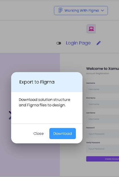
Export Solution
Click the download button to download the solution structure and Figma files to design.
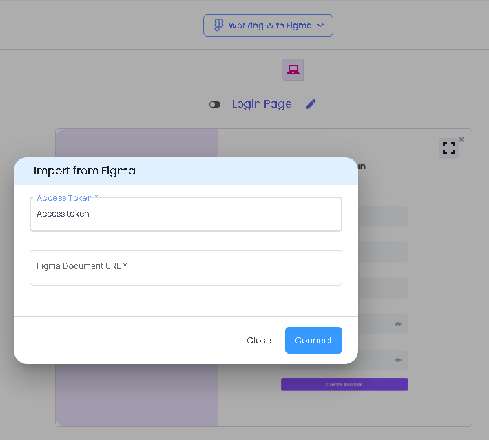
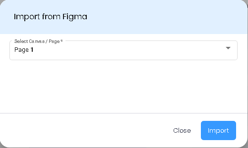
Import Solution
To import your solution to Xamun AI
| Feature | Description |
|---|---|
| Access Token | • Can be found on your Figma account, just generate and copy your personal access token. |
| Figma Document URL | • The url of your solution. • Copy it into your solution in Figma. |
| Select Canvas Page | • Choose the page of your solution in the dropdown menu. |
Media Library
Add a video of the prototype of your solution.

| Feature | Description |
|---|---|
| Upload Video File | • To upload a file video of your prototype. |
| Add Prototype Link | • To upload a video link of your prototype. |
Page Functions
This is the third step in creating a project. In this step, the user can personalize the Page per Module or Add Pages that are not included in the module.

| Feature | Description |
|---|---|
| Other Specs | • You can edit or add functional details to the page you're working on, including third-party APIs, logic, and computations. |
| Apply changes | • If clicked, it will apply all the changes made, if there are any, and redirect to the FINALIZE step. • If clicked and nothing was updated, no changes must be saved and will redirect to the FINALIZE step. |
Solution Summary
This is the last step in creating a project. The user can see the Solution Summary with total number of selected modules, Add-Ons and Project Card with selected platform.

| Feature | Description |
|---|---|
| Edit Project Name | • If clicked, it will allow the user to change the project name. |
| Selected Modules | • If clicked, it will show lists of pages that you selected and designed. |
| Platform Selection | • You can choose your platform for your solution. |
| Save Solution | • If clicked, it will save the created solution as draft and will be able to edit project. |
| Table of Contents | |||||
|---|---|---|---|---|---|
| Ideation Studio | Main Page | Design Studio | Project Hub | Build Studio | Go Live |